Joshua Hind
My name is Josh and I have a deep interest in all things technical and media related. I achieved two distinctions in my UAL Level 3 Extended Diploma in Creative Media Production and Technology. Now I am studying a Digital Media Bsc at the University of West England.
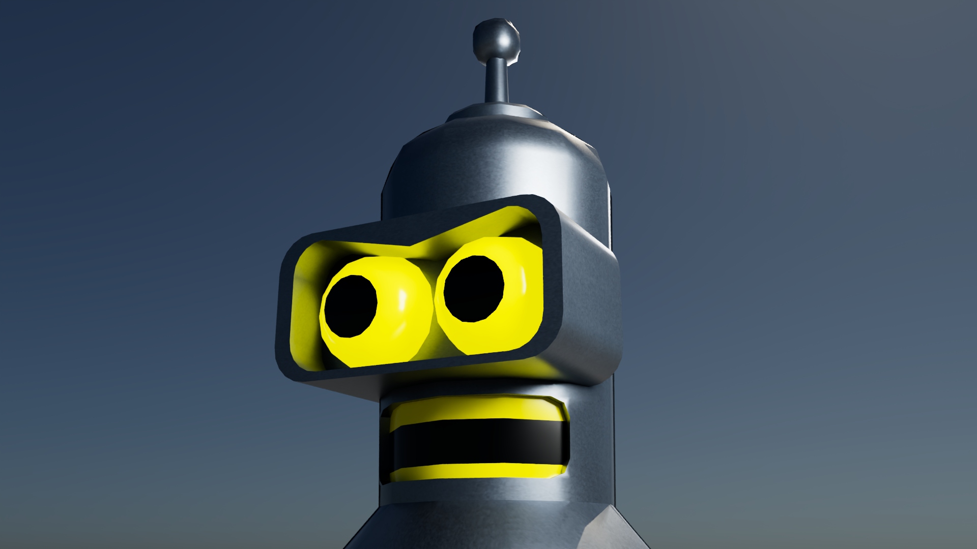
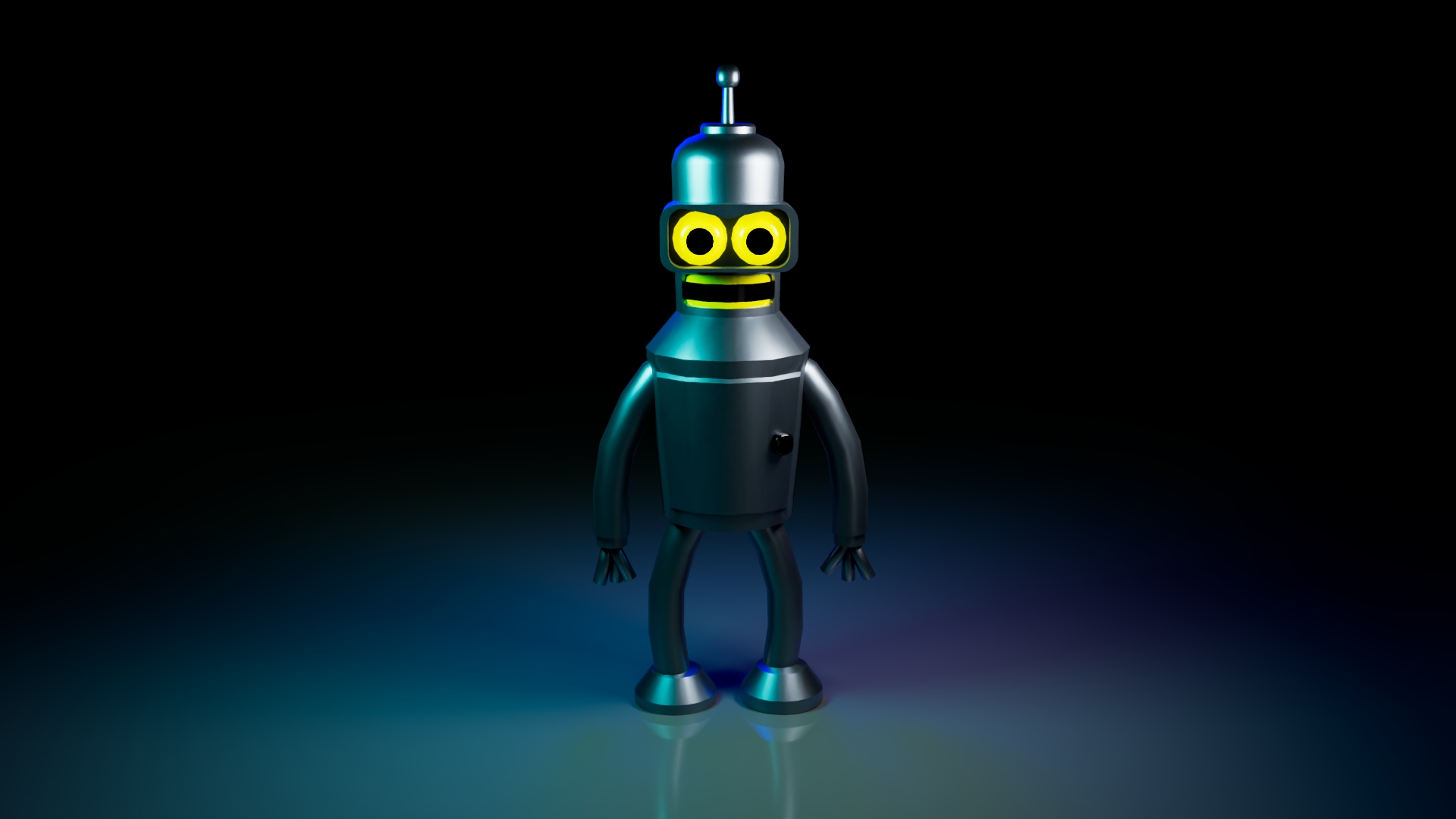
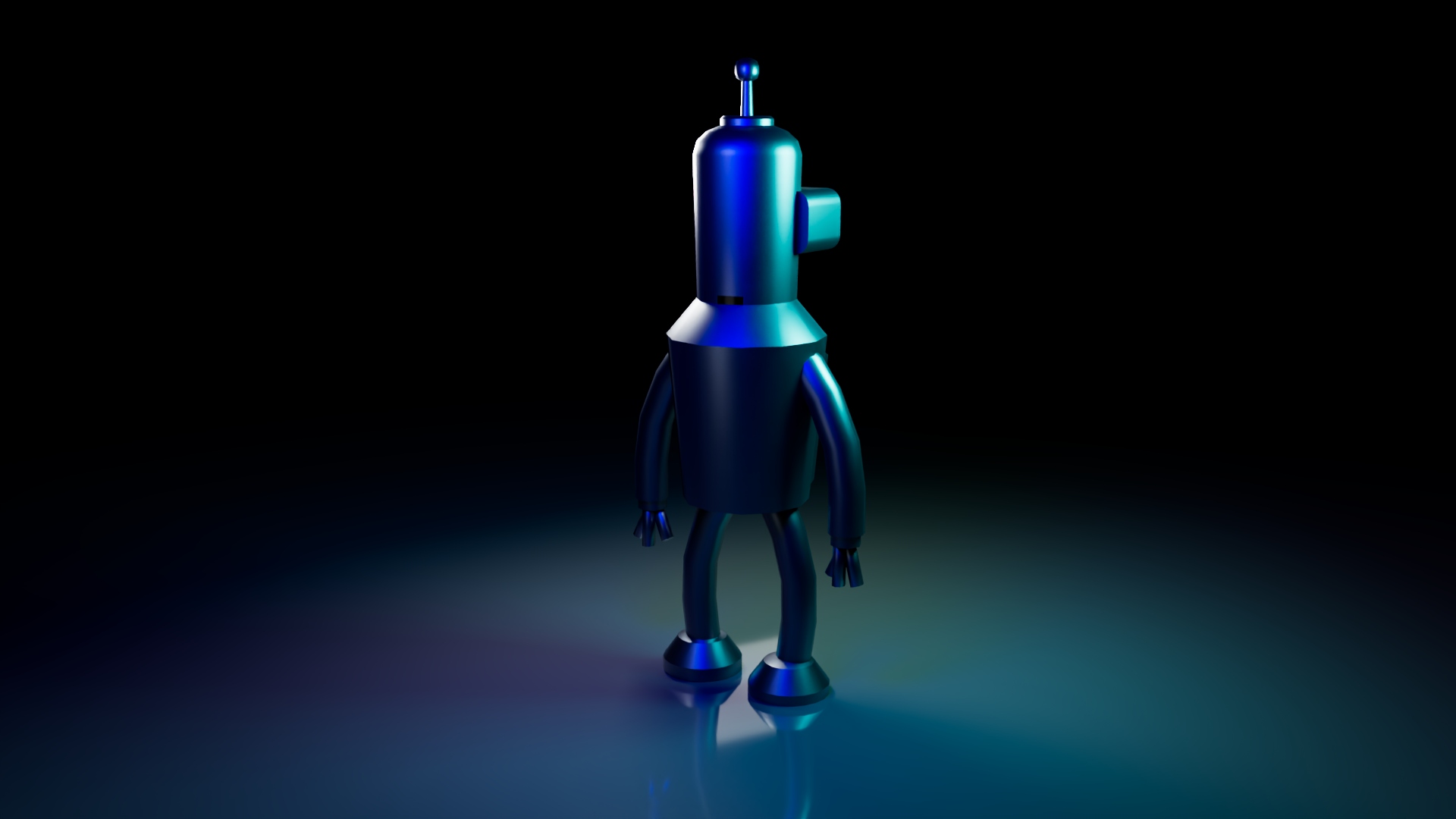
This is a 3D model that I made which is inspired by a Futurama character called Bender - created in the Maya application.
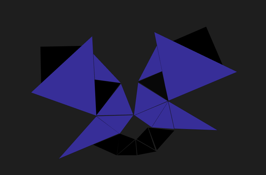
Wild Cat
For this compostion i chose a low poly art style to create an animal face. This one shows a cat style of graphic.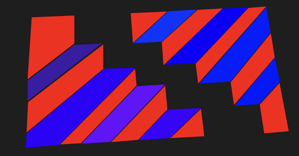
Crazy Stairs
This composition shows a staircase illusion style of graphic. This is made of 2D shapes which gives a 3D effect.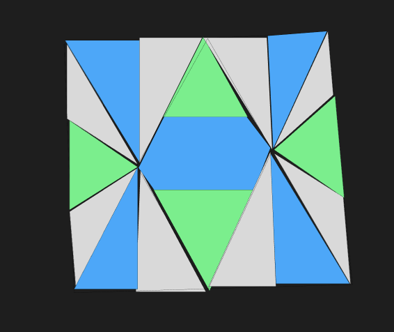
Shattered Glass
This last composition shows a shattered glass art pattern.Josh Hind's Portfolio Website - A Reflective Essay
1. Introduction
This essay reflects on what went well and what could have been better in relation to the website that I have built to showcase the three compositions in my portfolio. I used a couple of applications to design and build the site and its contents. I used Figma to create the overarching design and Bootstrap which gave me the template and made the site responsive. The website showcased three compositions which I designed: a) "Wild Cat" - a low poly art cat face graphic using a pattern art style b) "Crazy Stairs" - a 3D stair case effect using a repetition art style and c) "Shattered Glass" - a shattered stain glass window using a pattern art style.
2. Reflection - Critical Evaluation
What went well
- I quickly learnt and became comfortable with new applications such as Figma and Bootstrap. I learnt that I should be more curious about what applications exist to enable my website to be engaging.
- I was pleased with the 'JH' branding that I added to give the website a visual identity linked to me. This is something that makes the site appear more professional. I could make this even more impactful next time.
- The carousel with the compositions showcases them really well and keeps the user's interest. I like the designs that I created as they are bright and colourful and have a good impact.
- I also changed the style sheet from the standard one in the template to give my website more uniqueness and personality.
What could have gone better and how have I learnt from them
- My planning could have been better. I found the fact that the html was on one file and the CSS on another was confusing. I didn't give myself enough time at this stage of the planning to work this through without stress. Going forward I would give myself more time at each stage to avoid pressure.
- Although I was fairly happy with my compositions, I felt they could have been better if I had been more visionary with my ideas. Next time I will seek inspiration from other areas for my designs. So in this case I could have sought inspiration from modern art to push my thinking further.
- I also used the same artistic style for two of my compositions - "Wild Cat" and "Shattered Glass" were both pattern styles while "Crazy Stairs" was repetition. Next time I would use other artistic styles such as radical or rhythmic to make this standout.
- Finally I would ask for some feedback from users to get some additional ideas for improvement. This is something that is very important in website design to ensure the site is easy to use for the end user.
3. Summary
In summary, I really enjoyed this project. It has given me the foundations in website design and development. I am thinking about how I can use this learning to develop other websites. I will reflect on the things that went well and the things that could have gone better to make my next project even better.